Have you ever wondered why having a killer HVAC website is so crucial? Well, picture this: you’re searching for a reliable HVAC service. What’s the first thing you do? You hop online and go for the website that looks and feels great, right?
A website serves as a digital storefront for HVAC companies. As an important part of HVAC marketing, making a lasting first impression on potential clients is vital. In this article, we’re showcasing 10 great HVAC website examples for 2024. By looking at these websites, you’ll explore what made them so good and see if you can replicate the same results for your pages. Let’s dive in!
5 Factors We Considered When Selecting Websites
If you search the web long enough, you’ll find that not all HVAC company websites are created equal. Some are better than others, especially when it comes to SEO performance. Here are five things that can make your site stand out from the rest:
User-Friendliness
Have you ever felt lost in a maze while checking out a website? That’s what you’ll experience should you ever find yourself navigating an HVAC website that’s not user-friendly.
Awesome HVAC websites should make it easy for you and other visitors to find what you’re looking for, be it HVAC services, contact info, or FAQs. At the very least, it should have clear menus and navigable buttons.
Mobile Responsiveness
Most people are glued to their phones these days. This is why many businesses ensure their websites look as good on smartphones as on computers.
If you want your HVAC website to garner positive reviews, you must ensure it’s navigable on both phones and desktops. That means no wonky formatting or tiny text to squint at.
Page Loading Speed
Patience may be a virtue, but it’s usually in short supply when waiting for a website to load. The best HVAC website examples load in the blink of an eye, sparing you from tapping your foot in frustration and keeping you engaged from the get-go.
With quick loading times, you can swiftly access the necessary information without delays. This makes your browsing experience smooth and hassle-free.
Web Design
Who said the HVAC website design has to be boring? A visually appealing design is the key to catching your eye and keeping you engaged from the moment you land on the page.
Think vibrant colors, high-quality images, and a clean layout that’s easy on the eyes. Combined, these make browsing a pleasure rather than a chore. With an attractive design, you’ll find yourself drawn in and eager for more, whether by learning about their services or finding their helpful tips.
Content Quality
Flashy graphics are nice, but what truly distinguishes the best HVAC websites is the quality of their content. From helpful articles to informative blog posts and detailed service descriptions, top-notch content demonstrates an HVAC company’s expertise and commitment to assisting you.
When you find valuable information readily available, it’s a sign that the HVAC company isn’t just about looks but is genuinely focused on providing you with the knowledge and assistance you need to make informed decisions about your HVAC needs.
Our Top 10 HVAC Website Examples for 2024
By looking at the factors above, we’re able to close in on 10 HVAC brands. While their websites don’t have all the qualities we’re looking for, we think they’re worth putting on our list.
- Reddi Heating & Cooling
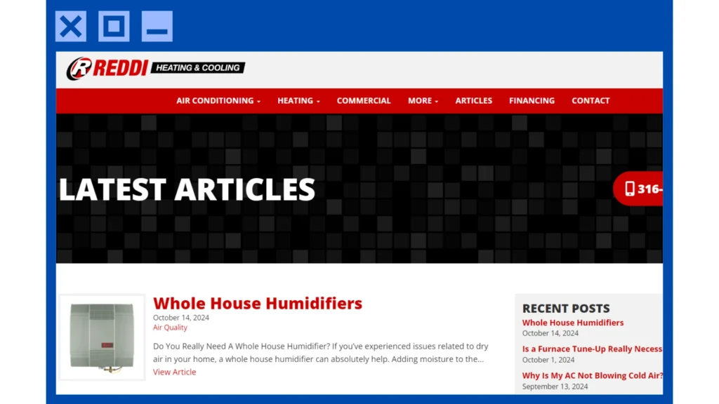
Reddi Heating & Cooling’s website stands out among others for several reasons. For starters, they have a blog section that lists a few useful tips related to HVAC.
Their website also has a basic layout, with a red-black-white color scheme that’s easy on the eyes. But more importantly, it’s navigable and user-friendly. Each button will take you to the page you’re looking for (whether it’s their service pages or their contact form).
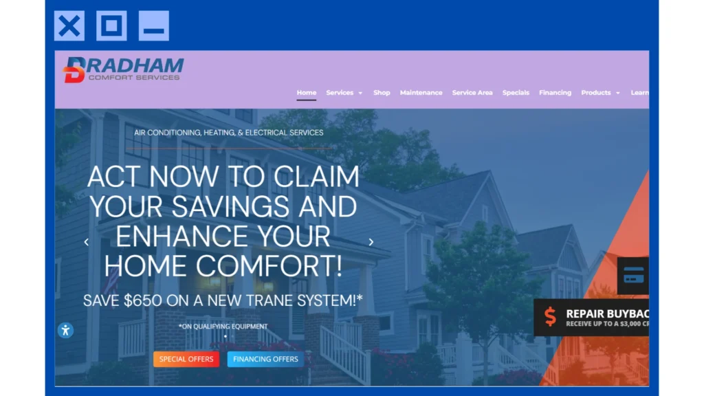
Bradham Brothers Inc. also nailed it as an excellent HVAC website example. Their site is a breeze to navigate (though sometimes slow to load), making it easy for website visitors to find what you need. It’s also mobile-friendly. Whether on your phone or computer, you’ll have a smooth browsing experience every time.
Moreover, their website design is clean and modern, with eye-catching graphics and colors that draw you in. And when it comes to content, Bradham Brothers doesn’t disappoint. They provide all the info you want about their services, along with helpful tips and insights to keep you informed.
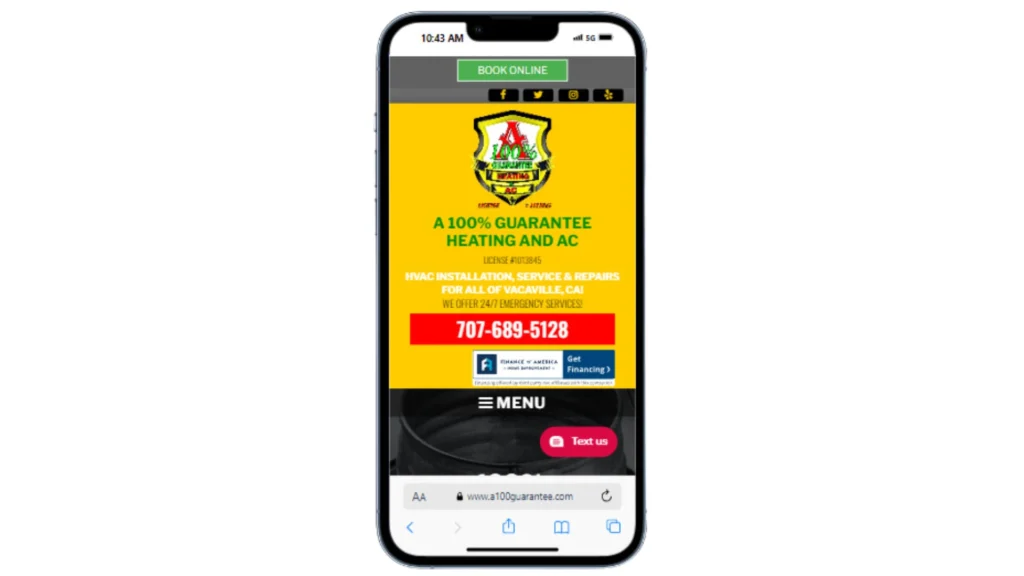
A 100% Guarantee knocks it out of the park with their stellar HVAC website! It’s easy to navigate, allowing you to find what you need pronto.
Plus, it’s mobile-friendly, meaning you’ll have an excellent time browsing on your phone and computer. Their design is also sleek and modern, combining black and yellow colors to grab your attention right away.
As for their content, their website has all the info you need about their cooling and heating services, along with helpful tips and tricks to keep your HVAC system running smoothly.
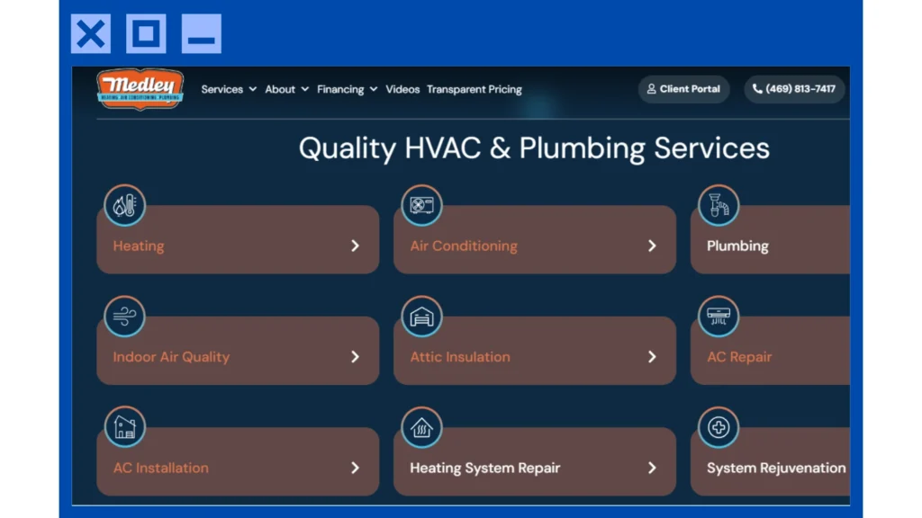
Similarly, Medley Heating & Air Conditioning hits the mark with their exceptional website! It’s incredibly user-friendly, making it effortless for you to navigate and find what you need. At the same time, their website design is fantastic, featuring captivating elements that set it apart from other HVAC websites.
It’s also totally mobile-responsive, ensuring a seamless browsing experience on your phone or computer (although there’s still room for improvement). The only downside is that they don’t have a blog section. However, they make up for it by providing individual landing pages for their services.
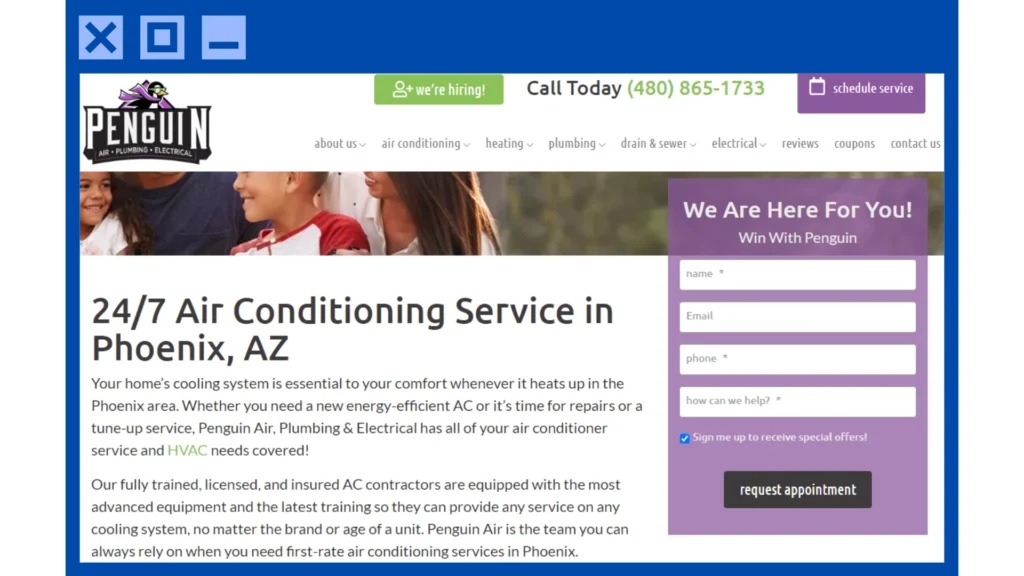
Penguin Air, Plumbing & Electrical excels as an HVAC business and rock it as an HVAC website example. Their pages are highly organized, with the main buttons listing their specific HVAC services.
The home page also has everything you need, from a summary of their services to coupons on their services. Using the right blend of white, green, and purple, they have a great HVAC website design that’s relaxing and enticing.
And guess what? They’re optimized for mobile devices, too! So whether you’re on your phone or computer, the browsing experience is smooth as ice.
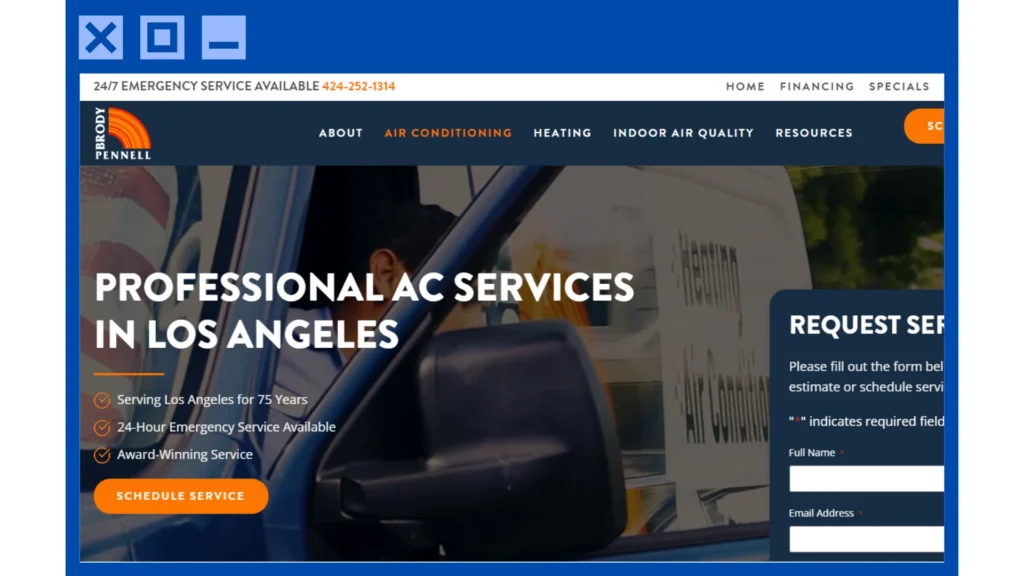
Like the previous examples, Brody Pennell Heating & Air Conditioning has an outstanding HVAC website. For starters, it loads fairly quickly. With intuitive menus and buttons, it’s also simple for anyone to navigate its pages.
Furthermore, their website design is sleek and contemporary, featuring eye-catching visuals and a warm color palette that draws you in. They also provide comprehensive information about their services and a blog and DIY tips section that lists advice to help you maintain your HVAC system.
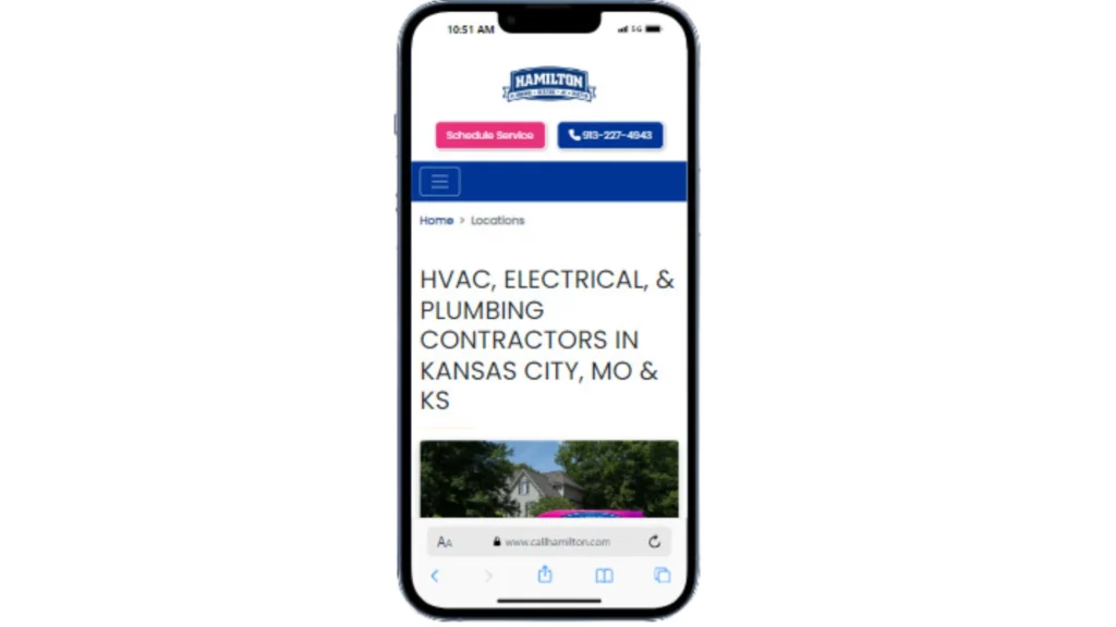
Hamilton Plumbing, Heating, A/C & Rooter boasts an incredible HVAC website that ticks all the boxes! Navigation is virtually a walk in the park, with its menus and buttons guiding you smoothly to what you need.
The site is optimized for both phone and computer. This ensures a pleasant browsing experience every time. Their website design is simple yet inviting, featuring eye-catching visuals and a vibrant blue-and-white color scheme that immediately captures your attention.
Lastly, they provide comprehensive information about their services. Aside from their service pages, they have a blog section that offers helpful tips.
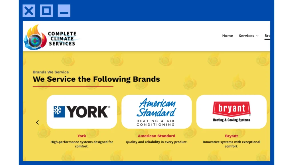
Complete Climate Services shines with its fantastic HVAC site. Despite having only a few menus and buttons, navigating through its pages is still easy. At the same time, it adapts flawlessly to mobile devices, which enables customers to enjoy a better browsing experience.
Their web design is simple and relatively straightforward, using the right combination of white and blue. However, their logo pops out, quickly getting the attention of online and local customers. The only downside is they still need a blog section. Also, they need landing pages that provide more details about their cooling company and services.
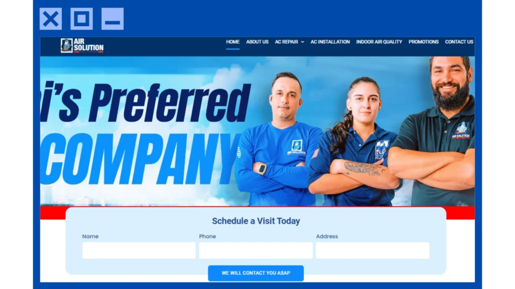
Air Solution & Repair can leave any visitor awestruck by its fantastic HVAC website. Its design is dynamic and modern, with elements that make it stand out. It even includes a few photos of their HVAC contractors posing! However, they need to improve their mobile-friendliness.
Navigation is also a breeze, thanks to clear menus and buttons. Site visitors can find what you need by browsing through its pages. To top it off, they have both landing pages and blogs. This lets visitors learn more about their services and showcases their HVAC mastery.
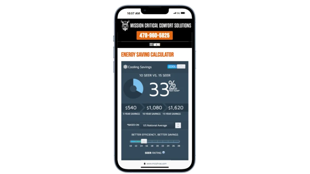
Lastly, we have Mission Critical Comfort Solutions. Like the previous HVAC website examples, it stands out thanks to its navigability and user-friendliness. Its menus and buttons can quickly help you find what you need.
Sporting an orange-and-black color scheme, their web design is also quite attractive. Combined with their Viking logo and other elements, it makes them a bit of a badass.
Then there’s their content. From useful blogs to informative landing pages, they ensure you get your time and money’s worth when visiting their website.
Improve Your Website Through These Examples
Do you want to take your HVAC website to the next level, too? Then take inspiration from the HVAC website ideas showcased above and give your website a glow-up. Your customers will thank you for it.
If you need help, feel free to contact us. We’ll help you make your HVAC website stand out, allowing you to gain more clients and increase your revenue.
Frequently Asked Questions
What makes an excellent HVAC website stand out?
A great HVAC website stands out for its user-friendly design, quick loading times, and informative content. It should also be easy for you to navigate, whether on your computer or phone, not to mention provide all the info you need about services and maintenance tips. Combined with a few unique HVAC advertising ideas, this can make your website pop out.
Why is mobile compatibility important for HVAC websites?
Mobile compatibility ensures that your website looks and functions just as well on smartphones and tablets as on desktops. This means that no matter how your customers access your site, they’ll have a smooth and enjoyable browsing experience.
What role does design play in an HVAC website?
Design is crucial for capturing your attention and making a great first impression. A visually appealing layout with vibrant colors and high-quality images can draw you in and keep you engaged. At the same time, a clean and modern design reflects professionalism and trustworthiness.
How can informative content benefit an HVAC website?
Informative content, such as detailed service descriptions and helpful blog posts, demonstrates your expertise and commitment to customer satisfaction. It also helps educate your customers about HVAC systems and maintenance, empowering them to make informed decisions.
Why is it important for HVAC companies to update their websites regularly?
Regular updates keep your website fresh and relevant, showing your customers you’re active and attentive to their needs. Whether you’re adding new services, sharing customer testimonials, or publishing informative articles, updating your website helps maintain its effectiveness and appeal.


